Let’s dive into the vibrant world of color theory. As a 3D artist doing this for a while, I’ve seen firsthand how color can shape a viewer’s experience, evoke emotions, and even guide attention. In my designs, color schemes are not an afterthought but a vital part of the creative process.
For this article, I looked at many resources, like long articles and helpful YouTube videos, to help you understand color theory better. I learned some new things, especially about the different color schemes and their meaning.
So, what’s in store for you? We’ll learn the basics of color theory, discuss what different colors mean, and look at some tools for picking colors. Let’s go!
Here are the sections we will explore:
What is Color Theory?
Why is Color Theory Important in 3D Art and Design?
The Color Wheel
Additive Color Model (RGB)
Subtractive Color Model (CMYK)
The Harmonious Color Schemes
Color Meaning
Choosing A Color Scheme
Using Color Palettes in 3D Art and Design
Color Selection Tools
What is Color Theory?
Color theory is a toolset that helps us understand and use color in art and design. It’s essential for making good art that conveys a message. It’s like a language of color, and when artists and designers learn this language, they can make better choices about what colors to use. Color theory can make art or designs look better and work better.
Why is Color Theory Important in 3D Art and Design?
Color theory is crucial in 3D art and design as it helps guide the viewer’s eye, tell a story, set the mood, and draw attention to critical elements. By learning color theory, artists can make intelligent choices to improve their work and connect with people who see it.
The Color Wheel
At the heart of color theory lies the color wheel, a circular diagram that presents colors in a logically structured format. The color wheel showcases primary colors (red, blue, yellow), secondary colors (green, orange, purple), and tertiary colors, mixtures of primary and secondary colors.
The color wheel is a circular diagram of colors arranged by their chromatic relationship. Primary colors are the base colors from which all other colors derive. Mix two primary colors and get secondary colors. Blend a primary and a secondary color; voila, you have tertiary colors.
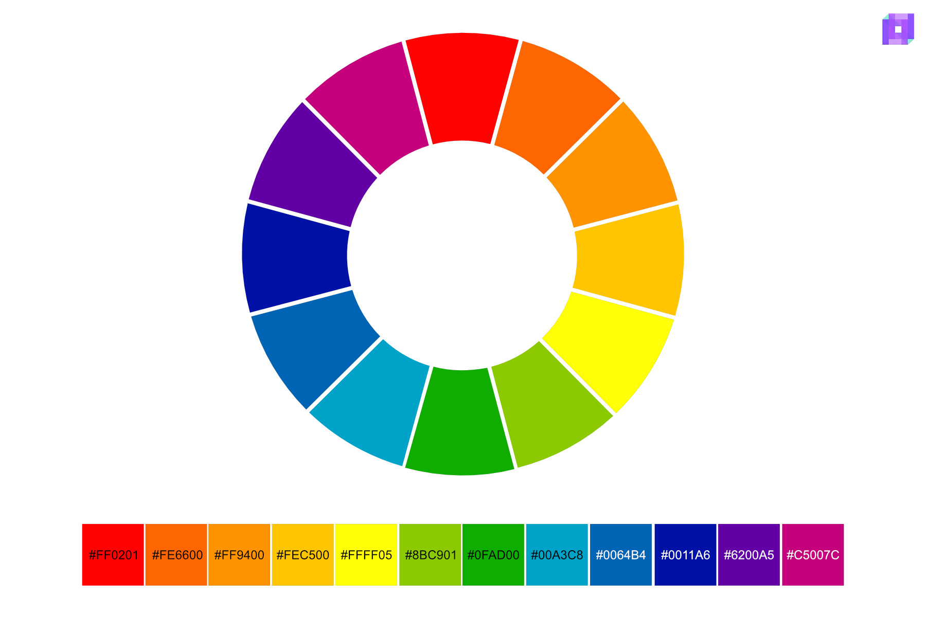
Let’s dive deeper into these colors.
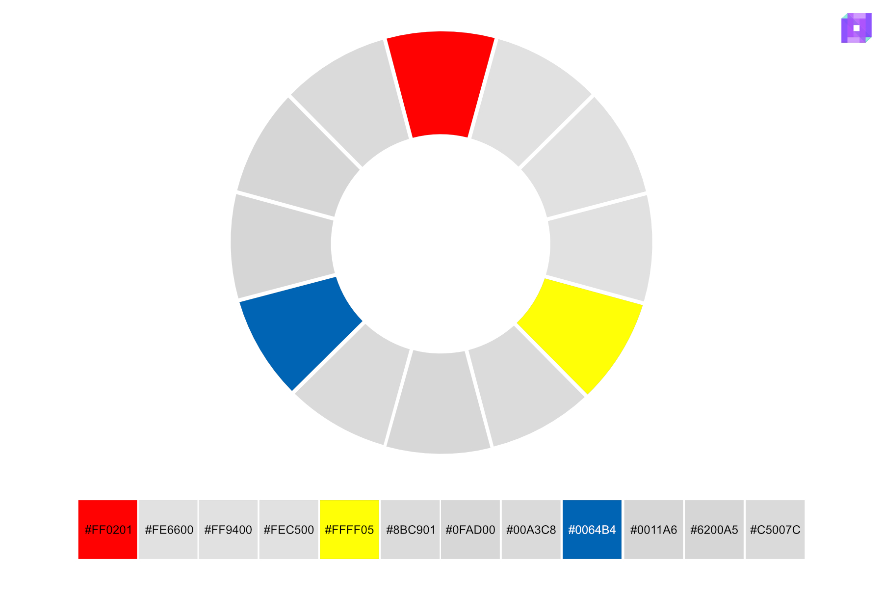
What Are Primary Colors?
Primary colors are the cornerstone of all other colors; they are the purest form of color that cannot be created by mixing different colors. In traditional color theory, these primary colors are red, blue, and yellow. They are the starting point in the color wheel.
What Are Secondary Colors?
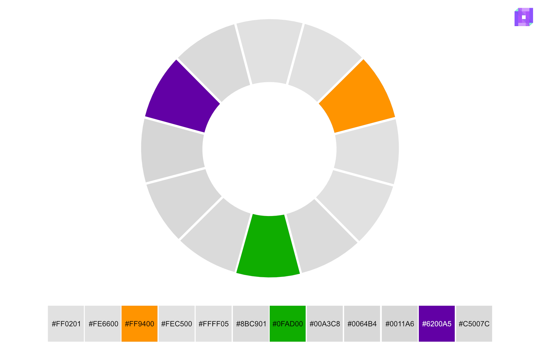
Secondary colors are the vibrant offspring of primary colors. You form secondary colors when you mix two primary colors in equal parts. The secondary colors are green, orange, and purple, each derived from a unique combination of primary colors.
Green is the result of mixing blue and yellow. Orange, a blend of red and yellow. Purple, born from the union of blue and red.
Secondary colors occupy a significant place on the color wheel, positioned between the primary colors used to create them. They add complexity to color schemes and offer more nuanced ways for artists and designers to express moods and convey messages.
What Are Tertiary Colors?
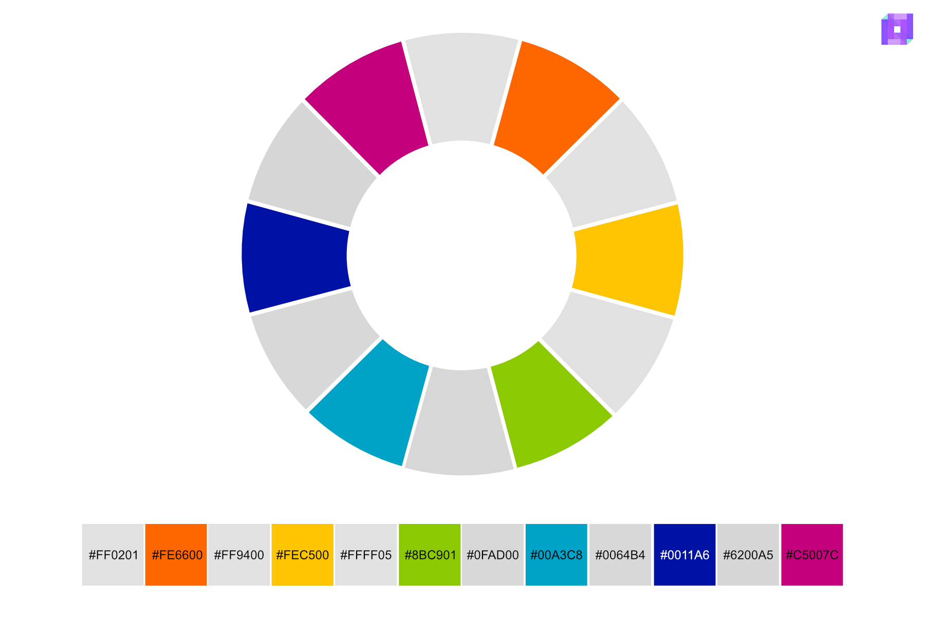
Tertiary colors are like the cousins of primary colors. When you mix a primary color with a secondary color next to it, you make tertiary colors. Tertiary colors add more options to the color spectrum.
The six tertiary colors are red-orange, yellow-orange, yellow-green, blue-green, blue-violet, and red-violet. Each color gets its name from the primary and secondary colors used to make it. The primary color’s name always comes first.
To illustrate, you can create red-orange by combining red and orange and blue-green by mixing blue and green. These colors give artists more choices, helping them make more detailed and exciting designs.
But there’s more to color than meets the eye. A color’s hue, tint, and shade are fundamental concepts that describe various properties and variations of colors.
Hue
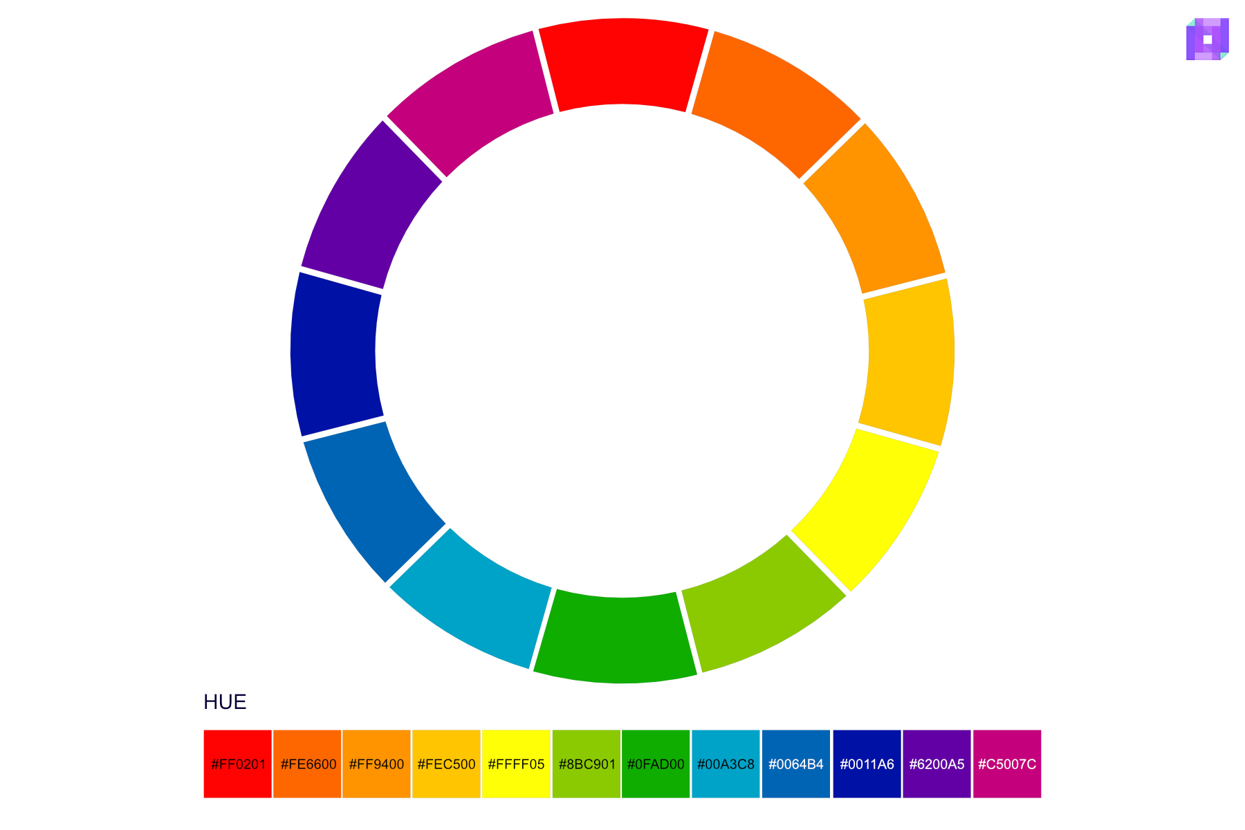
People often use ‘hue’ to mean ‘color.’ Still, technically, it means pure colors on the color wheel before adding any white, black, or gray. Hues are the main parts of any color scheme and include primary (red, blue, yellow), secondary (green, orange, purple), and tertiary colors.
Tint
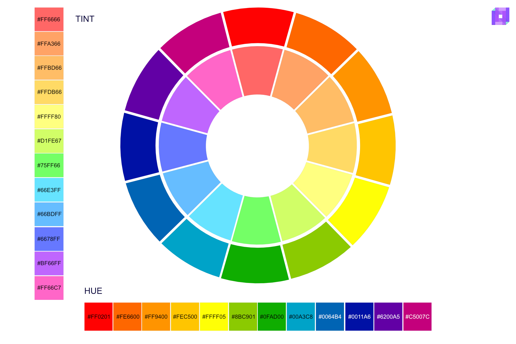
When you add white to a hue, it creates a variation called “tint”. Adding white lightens the hue, making it less intense and more delicate. For example, adding white to red creates pink, a tint of red.
Shade
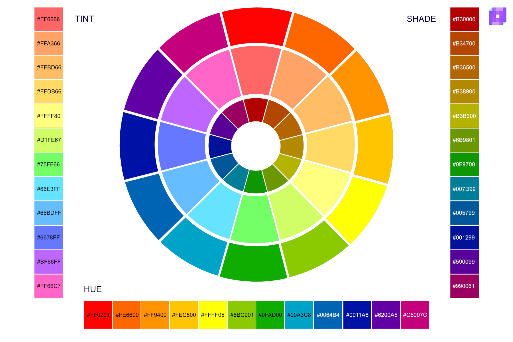
‘Shade’ is the opposite of tint. You can create a ‘Shade’ when you add black to a hue, making the hue darker and more intense. For instance, adding black to green results in a darker, deeper green.
Knowing about hue, tint, and shade is essential for artists and designers. It helps them change colors to make their work look and feel the way they want it to.
Let’s look into RGB and CMYK; I am sure you have seen or worked with these color models.
Additive Color Model (RGB)
The Additive Color Model, also known as RGB, is a way we make colors by adding light. RGB stands for Red, Green, and Blue, the primary colors used in this model.
In the RGB model, values range from 0 to 255, where 255 is the maximum intensity. We mix red, green, and blue light differently to make various colors. We get white light when we combine red, green, and blue light at full intensity (RGB 255, 255, 255). When there’s no light, we see black (RGB 0, 0, 0). Theoretically, a total of around 16.8 million different colors can be mixed with the RGB model.
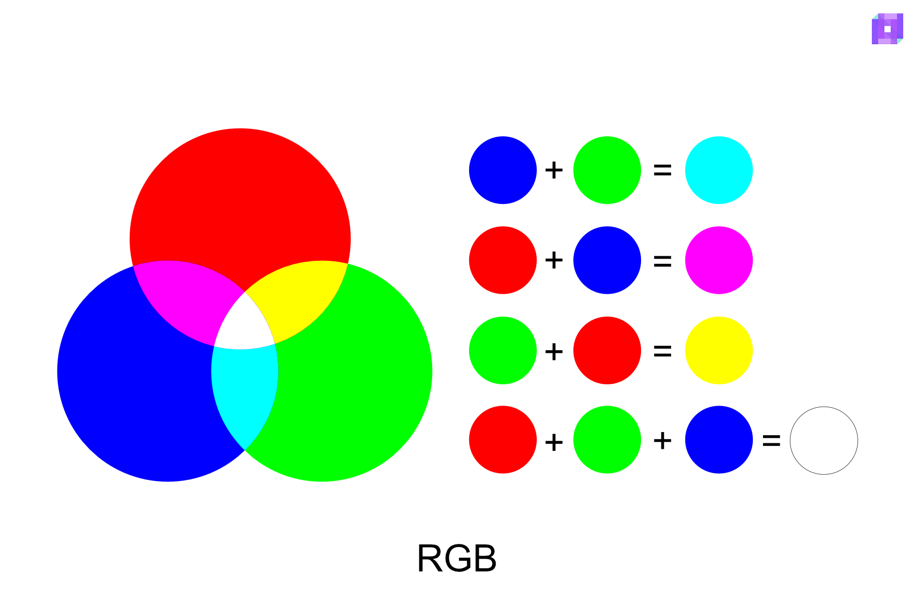
We call this model ‘additive’ because the more light we add, the closer the color gets to white. We often use this model in electronics such as computer screens, TVs, and smartphones.
Understanding the RGB model is vital for people who make digital art or designs. It helps them control colors on the screen to ensure the colors look right and pop.
Subtractive Color Model (CMYK)
The Subtractive Color Model, or CMYK, is how we make colors for books and magazines. CMYK stands for Cyan, Magenta, Yellow, and Key (a fancy name for black). These are the main colors used in this model.
Unlike the Additive Color Model (RGB), which makes colors by adding light, the CMYK model makes colors by removing or absorbing light. You get a gray or black color when you mix cyan, magenta, and yellow in equal parts. When you don’t add color, the result is white.
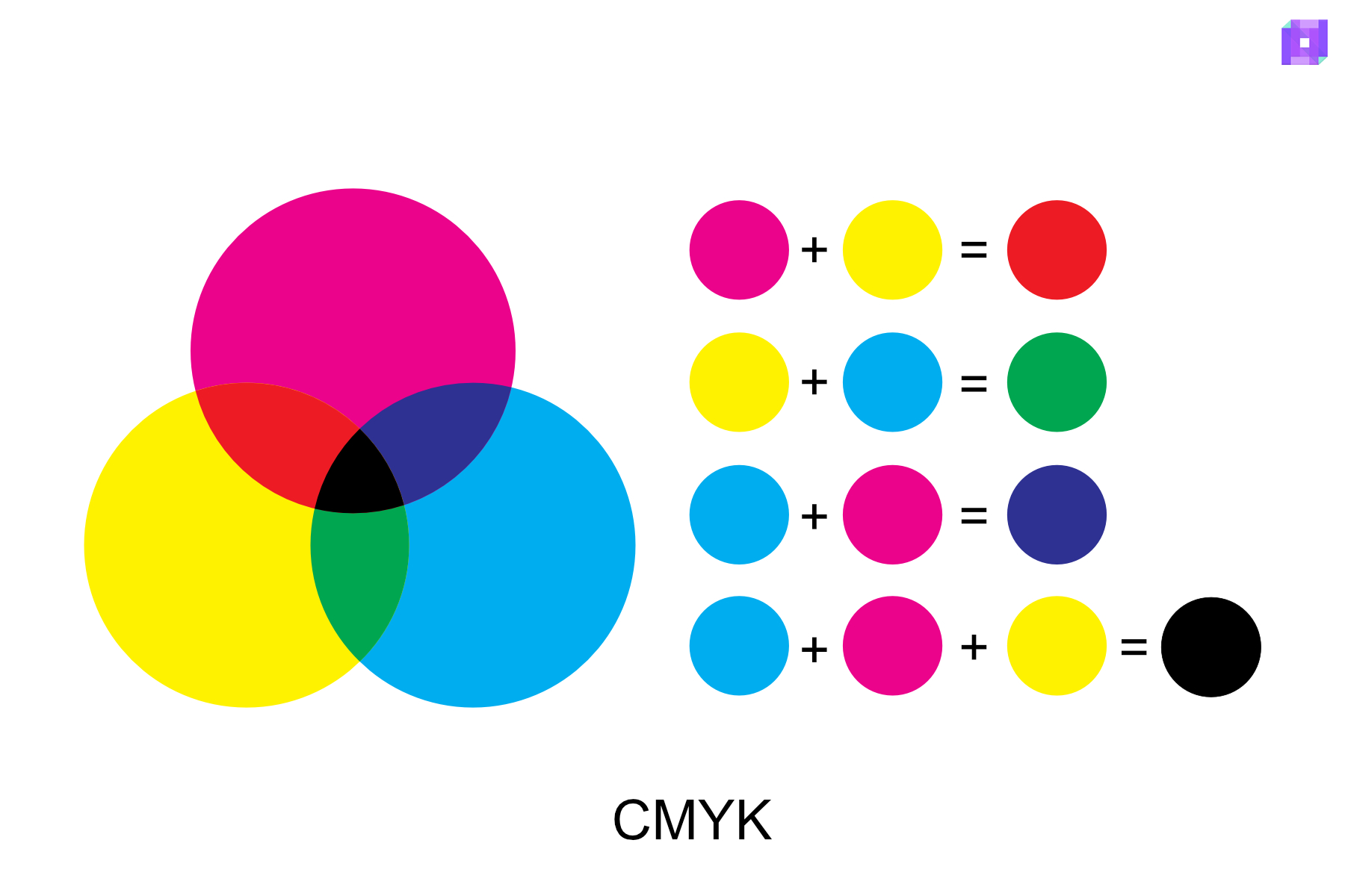
The word ‘subtractive’ means to take away. In this model, colors take away specific colors of light and reflect others. For example, yellow absorbs blue light and reflects red and green light, which our eyes see as yellow.
The CMYK model is fundamental when we print business cards, flyers, product packaging, and printed T-shirts. It helps us make sure the colors look correct and consistent. So, if you’re making art for a book or a magazine, understanding this model can help you a lot!
TIP: If you prepare an image for print, you work in RGB first (since it can show more colors) and then convert it to CMYK for print.
The Harmonious Color Schemes
Harmonious color schemes are ways of picking colors that look good together. They’re like recipes for colors! There are several types of these schemes. These schemes help artists make their work look balanced and pleasing to the eye and can portray a certain feeling.
Let’s dive deeper:
Monochromatic Color Scheme
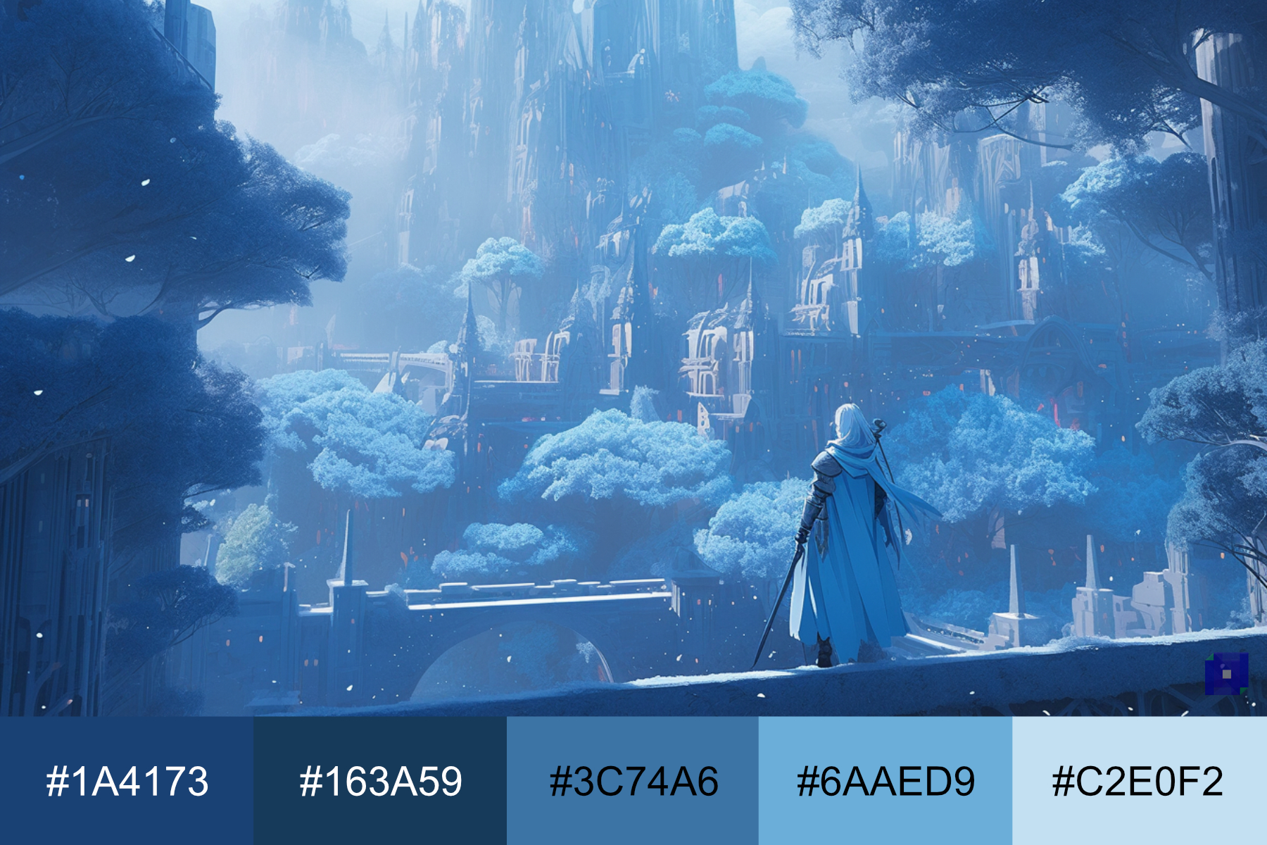
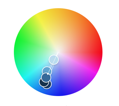
A monochromatic color scheme uses one color in different shades, tints, or tones. Think of it like starting with a color—let’s say blue—and then using light blue, dark blue, and everything in between.
You can use a monochromatic color scheme to create a mood or feeling. Because all the colors are related, it creates harmony and simplicity. This scheme can make your design feel calm, balanced, and easy on the eyes.
For example, a monochromatic scheme with blues might be an excellent choice to create a peaceful scene, like a quiet winter night. It can help portray feelings of calm, peace, and coolness.

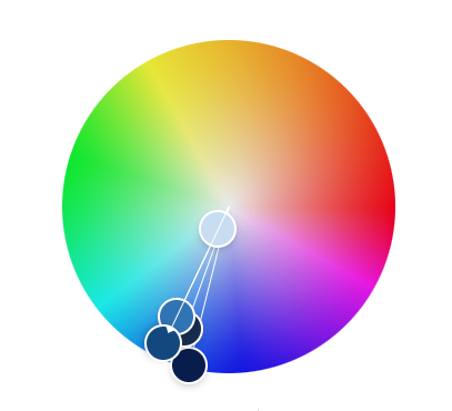
If you are working on a medieval fantasy scene, you can incorporate a monochromatic color scheme to portray calmness and peace.
Analogous Color Scheme
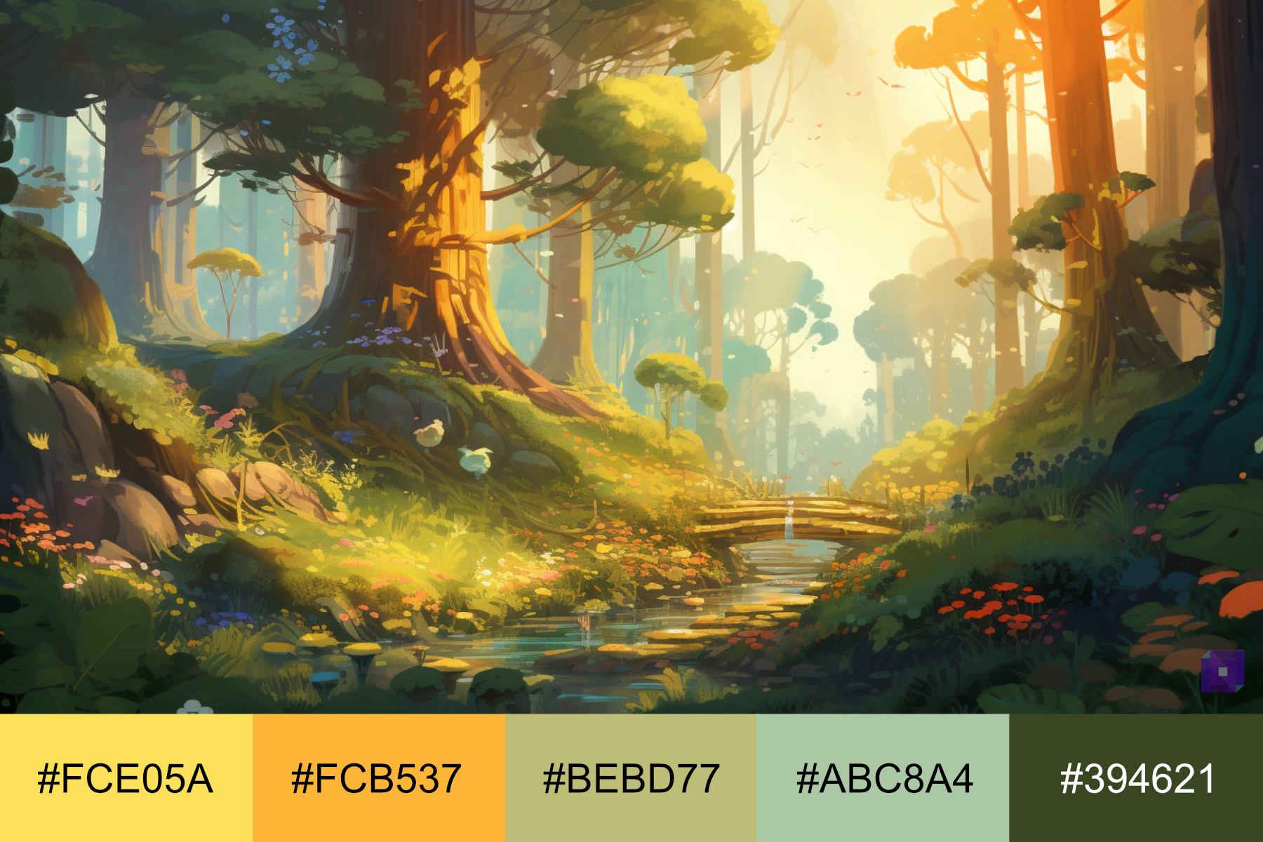
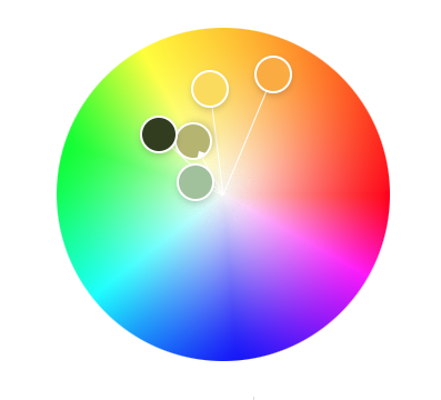
An analogous color scheme is when you use colors next to each other on the color wheel. For example, if you pick green, an analogous scheme might include yellow-green and blue-green.
Use analogous color schemes to create a sense of harmony and unity. Because the colors are close to each other on the color wheel, they blend well together and are pleasing to the eye.
For instance, if you’re creating a picture of a sunny forest, an analogous scheme with greens and yellows might be a good choice. It can help portray feelings of warmth, nature, and growth.
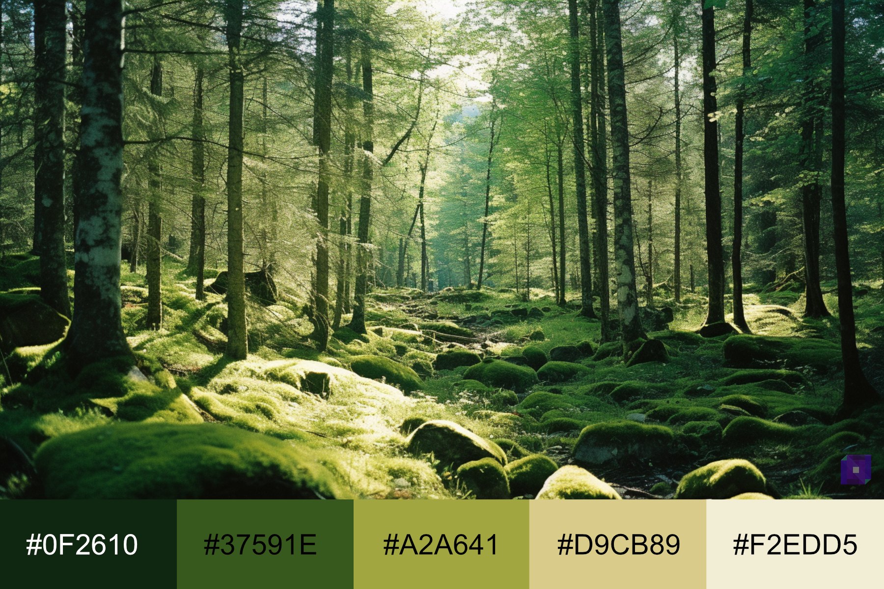
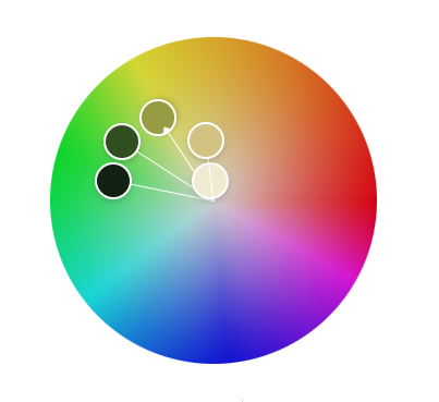
Creating a cartoon forest scene with an analogous color scheme of greens and yellows can also portray warmth and growth.
Complementary Color Scheme
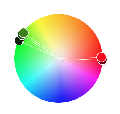
A complementary color scheme is when you use colors directly opposite each other on the color wheel. For example, if you pick red, its complementary color would be green.
You can use a complementary color scheme to create a strong contrast and make certain elements stand out. Because the colors are opposites, they can make each other appear brighter when placed next to each other.
For instance, if you’re creating a picture of a bright red apple on a green grass field, a complementary scheme with red and green might be a good choice. It can help the apple stand out and look even more vibrant against the green grass.
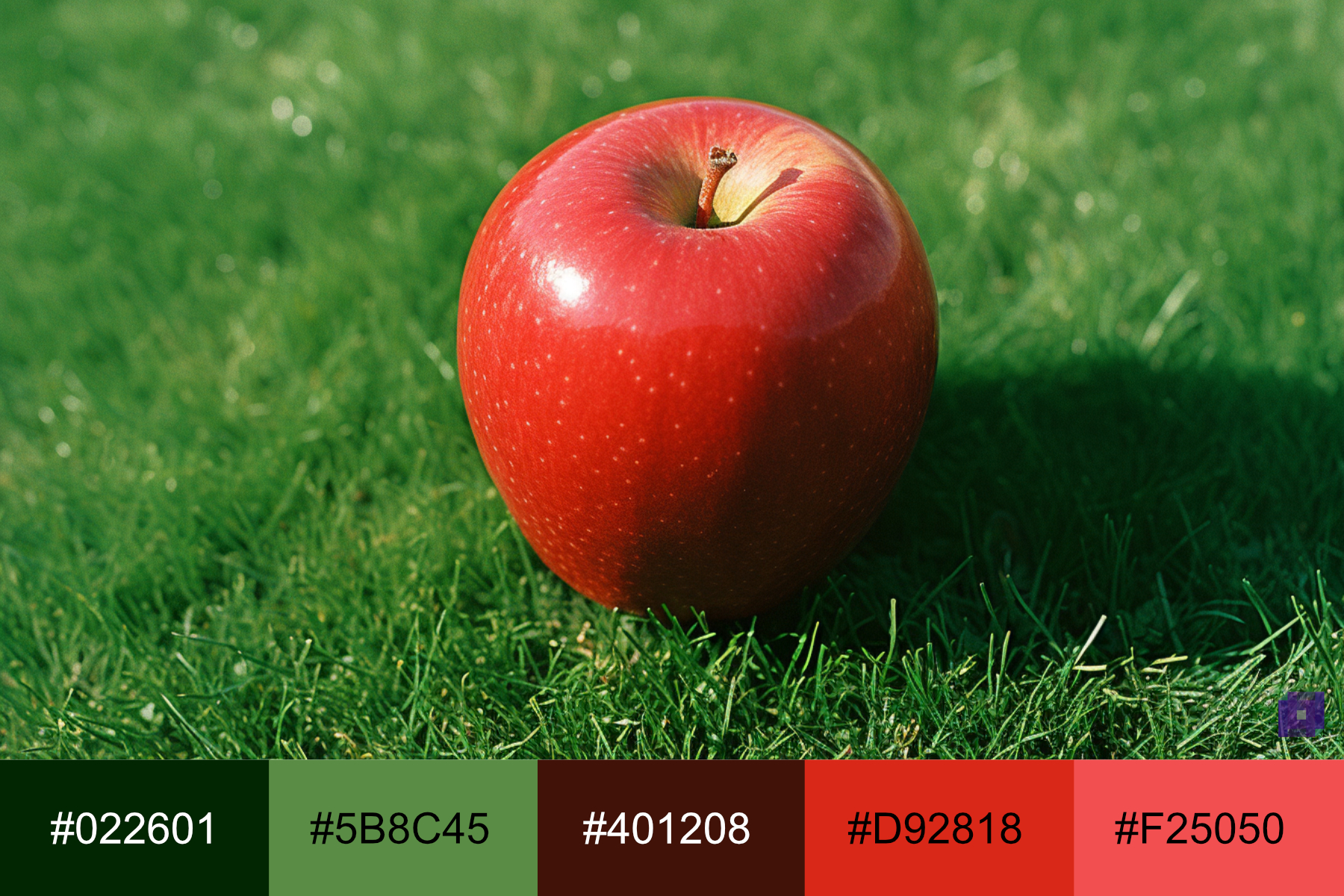
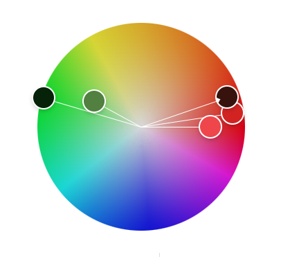
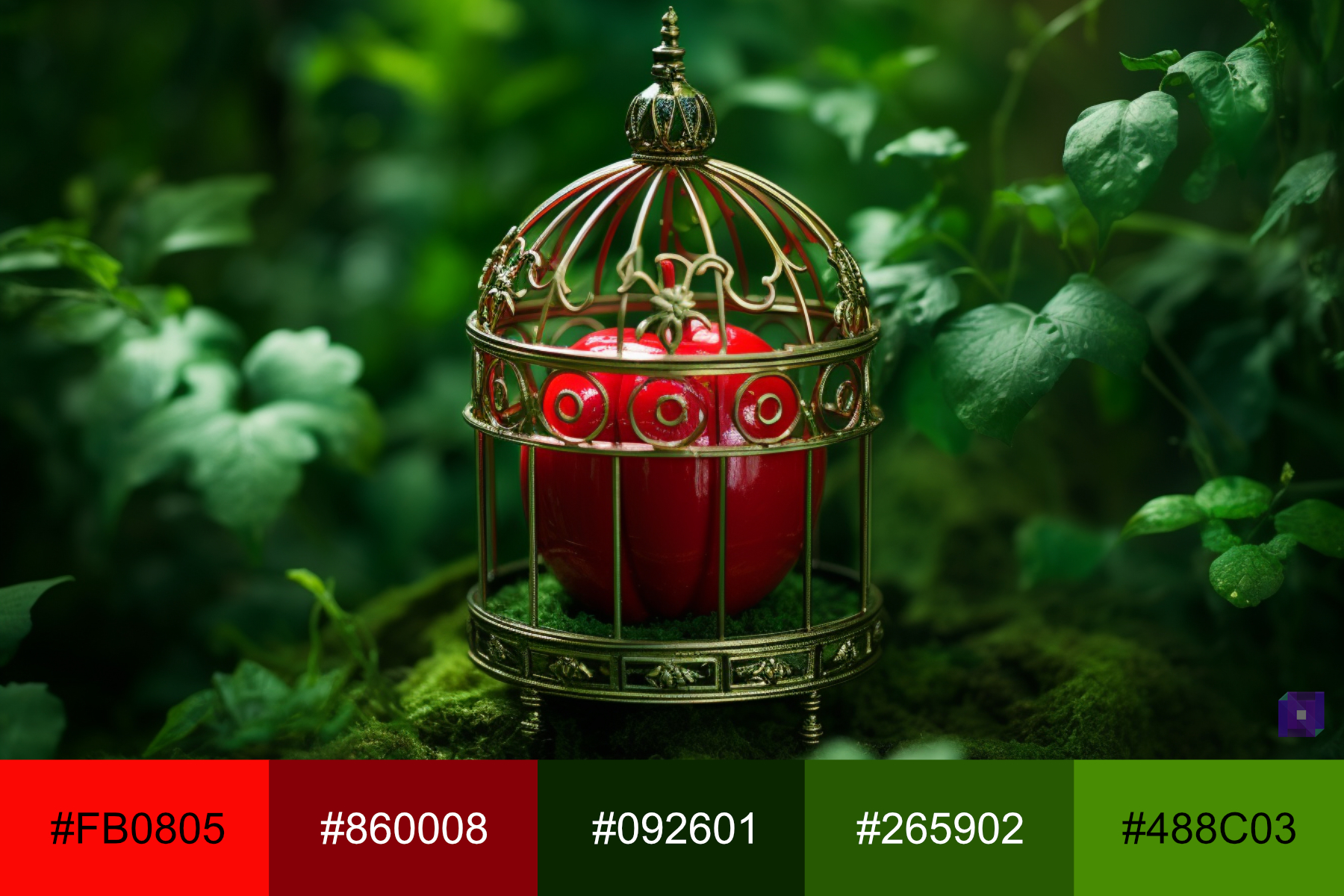
If you are going for a more fantasy looking scene, check out how this red apple pops out from the green background.
Split Complementary Color Scheme
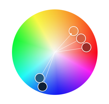
A split complementary color scheme is when you choose one color and then pick the two colors next to the opposite of the selected color. For example, if you prefer orange, its split complements would be blue-green and blue-violet.
You can use split complementary color schemes when you want a significant color difference, like in a complementary scheme, but still make it less intense. Because the colors are not direct opposites, the contrast is more subtle but still eye-catching.
For instance, if you’re creating a picture of a sunset over the ocean, a split complementary scheme with orange, blue-green, and blue-violet might be a good choice. It can help portray the warm orange glow of the sunset against the cool blues of the ocean and sky.
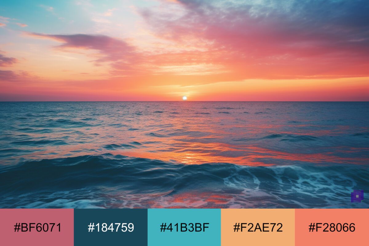
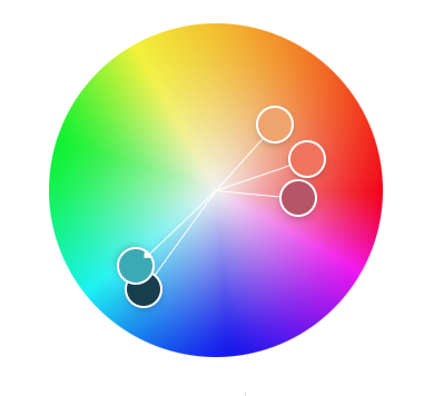
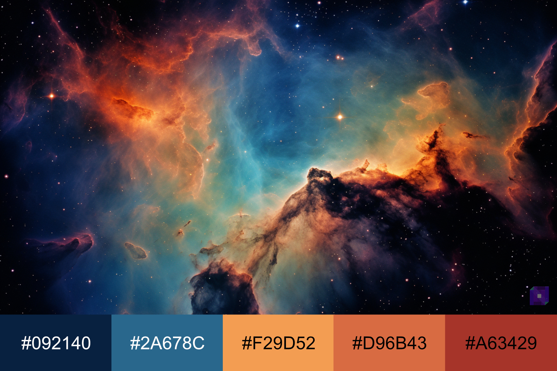
Or if you are going for a space scene using a split-complementary color scheme of orange and blues, you will see that the colors are balanced.
Triadic Color Scheme
A triadic color scheme is when you use three evenly spaced colors on the color wheel. For example, if you choose red, a triadic scheme would have blue and yellow. These colors are all the same distance apart on the color wheel.
Use a Triadic color scheme to create a vibrant and lively look. The evenly spaced colors offer a high contrast while still being harmonious.
For instance, a triadic scheme with red, blue, and yellow might be a good choice if you’re creating a picture of a circus scene. It can help portray a circus’s fun, energetic, and exciting atmosphere.
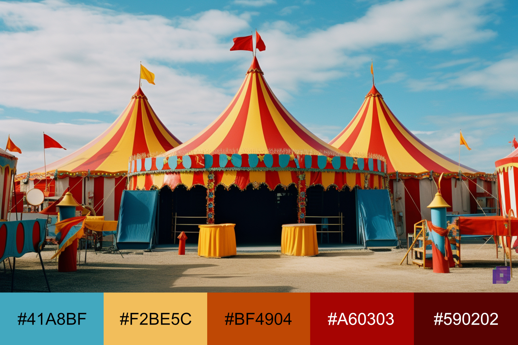
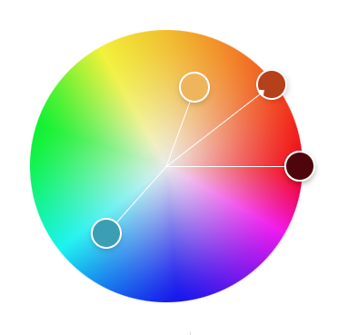
For example, if you are going with a more illustrative style for a children’s book, you can see how the triadic color scheme of yellows, blues, and reds can portray a fun and energetic environment.
Square Color Scheme
A square color scheme uses four colors the same distance apart on the color wheel. For example, if you choose red, a square scheme would have blue, green, and orange.
When you want to create a rich and diverse look, use a square color scheme. The evenly spaced colors offer a lot of contrast, but they still work well together.
For instance, a red, blue, green, and orange square scheme might be a good choice if you’re creating a picture of a bustling city scene. It can help portray the variety and energy of city life.
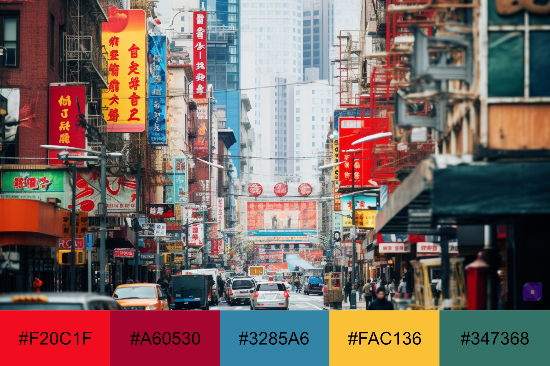
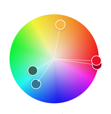
Another example of a square color scheme in a cyberpunk city scene.

Tetradic Color Scheme
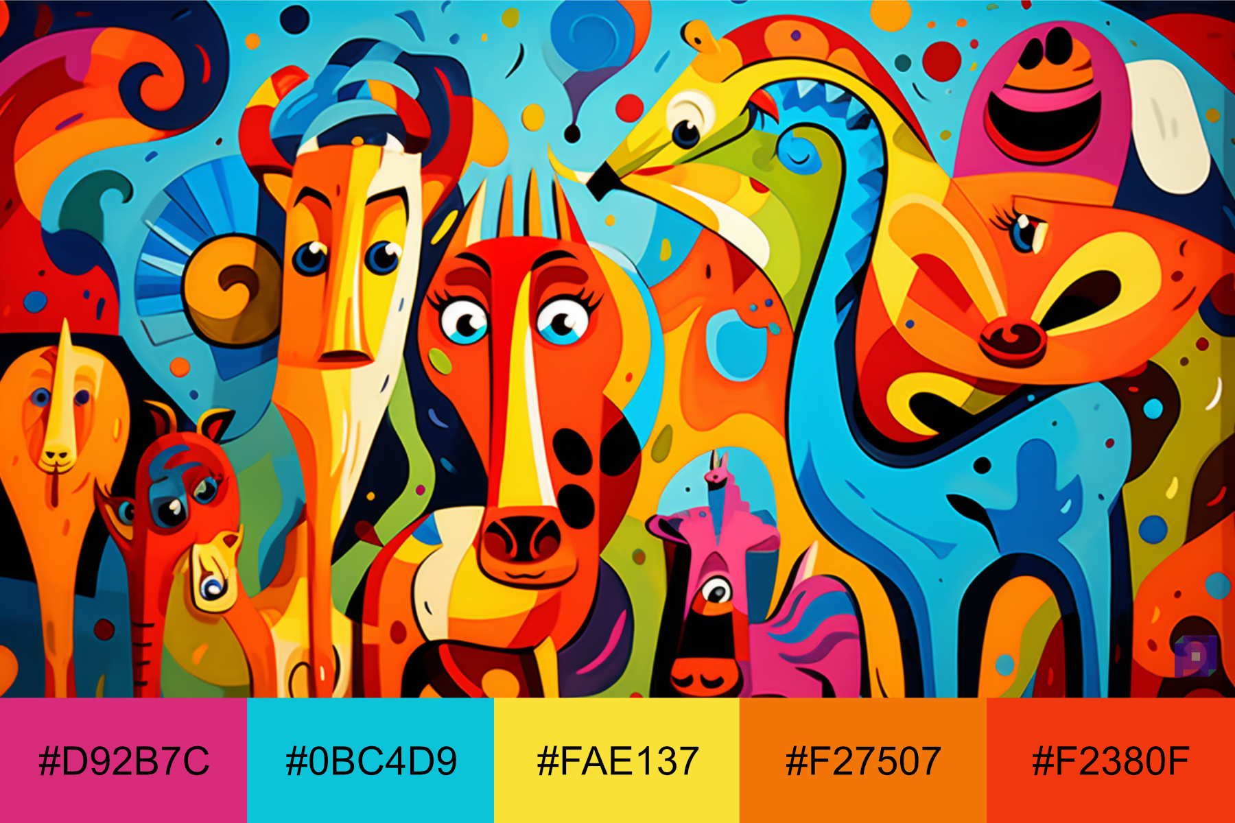
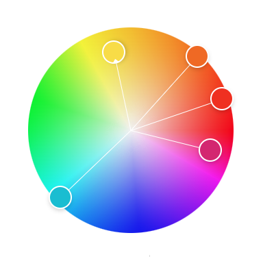
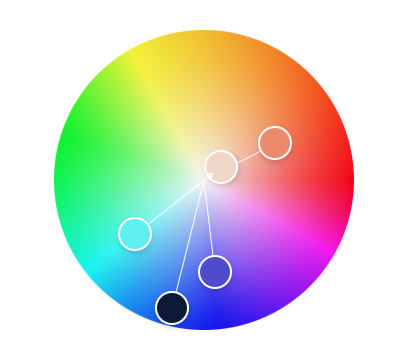
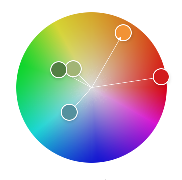
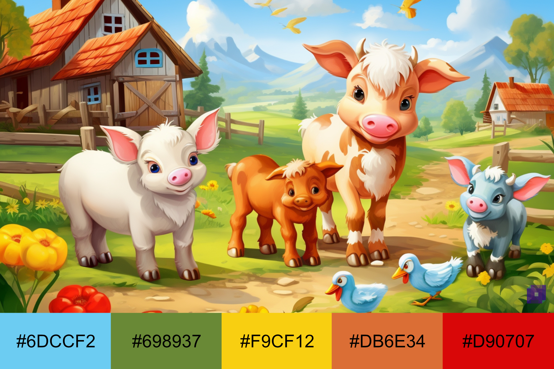
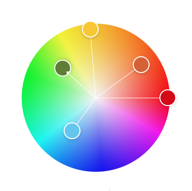
A tetradic color scheme, or rectangle scheme, is when you use four colors from the color wheel that are two pairs of opposites. For example, if you choose red and orange, their opposites are green and blue. Such a tetradic scheme would have red, orange, green, and blue.
Tetradic color schemes can create a lot of variety and contrast in your work. Because you’re using four colors, it can be tricky to balance, but it can look vibrant and exciting.
For instance, if you’re creating a picture of a colorful carnival, a tetradic scheme with red, orange, green, and blue might be a good choice. It can help portray a carnival’s fun, energetic, lively atmosphere.
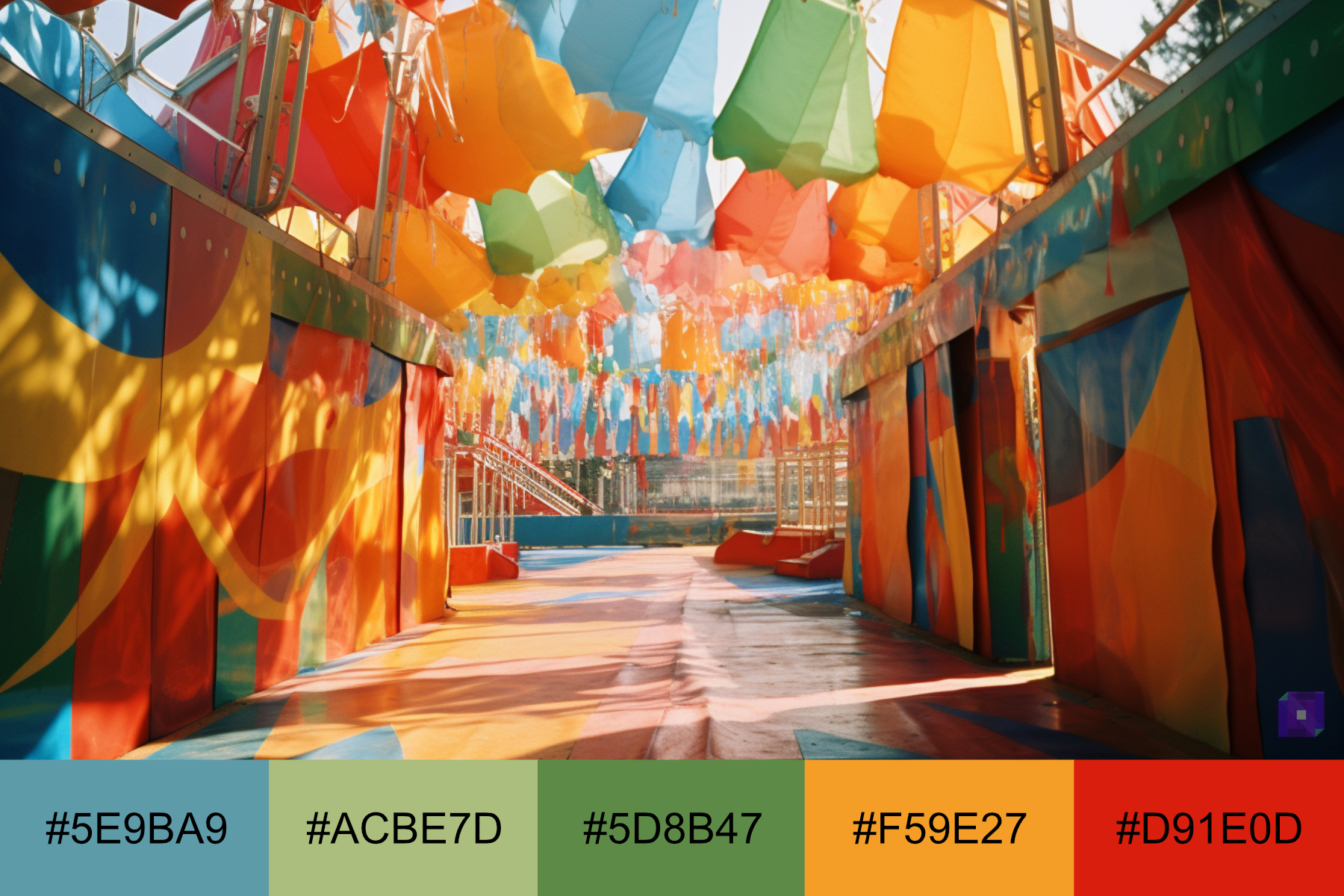
You can easily use a tetradic color scheme if you design a cute animal farm composition for a children’s show.
Color Meaning
Each color has its meaning and can make you feel a certain way. Let’s see what each color means and some famous examples.
Red
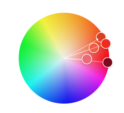
Red is a mighty color that often stands for strong feelings. It can represent love and passion but also danger or warning. In many cultures, red is a color of celebration and good luck. When you see red, it makes you think of excitement, energy, or importance.
A great example of red is the iconic red of Coca-Cola’s logo. This red is instantly recognizable and has become synonymous with the brand. The red logo conveys energy, passion, and excitement, which aligns with the company’s branding.

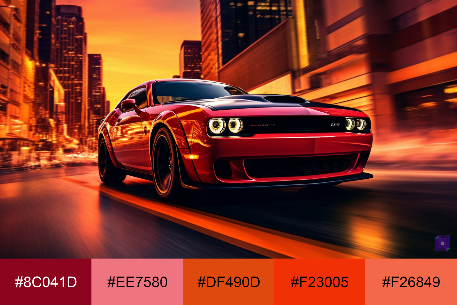
Or look at his image of a red muscle car on a vibrant cityscape at sunset, the image has varying tones of red, creating a feeling of excitement and vitality.
Green
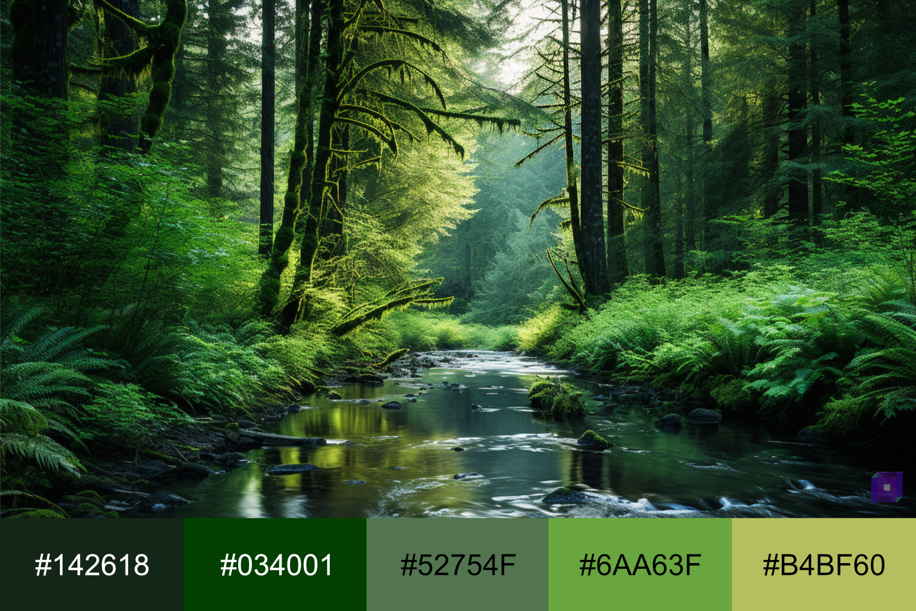
Green is a color that often makes people think of nature and growth. It can represent freshness, safety, and harmony. In many cultures, green is a color of luck and prosperity. When you see green, it makes you feel calm, relaxed, or hopeful.
A famous example of the color green is the Starbucks logo. The green color in the Starbucks logo is instantly recognizable and has become a symbol of the brand. It conveys freshness, growth, and a sense of calm, aligning with the company’s mission to inspire and nurture the human spirit.

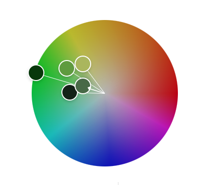
This image of a lush forest with the majority of green tones portrays freshness, growth, and a sense of calm.
Blue
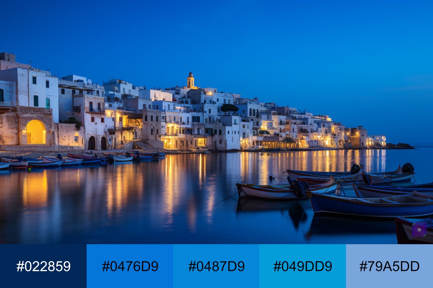
Blue is a color that often makes people think of the sky and the sea. It can represent calmness, stability, and trust. In many cultures, blue is a color of peace and tranquility. So, when you see blue, it might make you feel relaxed, safe, or thoughtful.
A great example of the color blue is the Facebook logo. The blue in the Facebook logo is instantly recognizable and has become a symbol of the social media platform. It conveys trust, reliability, and a sense of community, aligning with the company’s mission to bring the world closer together.

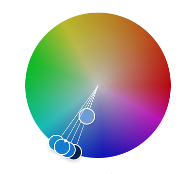
This image of a coastal village is made up of mostly blue tones; it conveys community, reliability, and calm.
Yellow
Yellow is a color that often makes people think of the sun and light. It can represent happiness, energy, and creativity. In many cultures, yellow is a color of joy and optimism. When you see yellow, it makes you feel cheerful, inspired, or excited.
An example of the color yellow is the McDonald’s golden arches logo. The yellow color is easy to recognize and stands for the fast-food chain. It shows friendliness, fun, and fast service, which matches the company’s goal to make tasty food quickly for everyone.

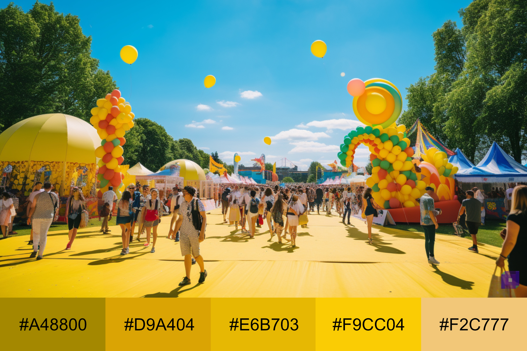
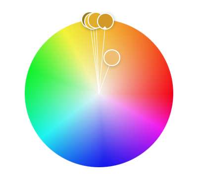
In this image of a carnival, you can see many yellow notes that portray the carnival’s energetic and fun environment.
Orange
Orange is a color that often makes people think of warmth and energy. It can represent enthusiasm, creativity, and change. In many cultures, orange is a color of adventure and social communication. When you see orange, it makes you feel excited, energetic, or curious.
An excellent example of the color orange is the Home Depot logo. The orange color is easy to recognize and represents the home improvement store. It gives a feeling of warmth, usefulness, and positive vibes, just like the company’s aim to help people improve their homes.

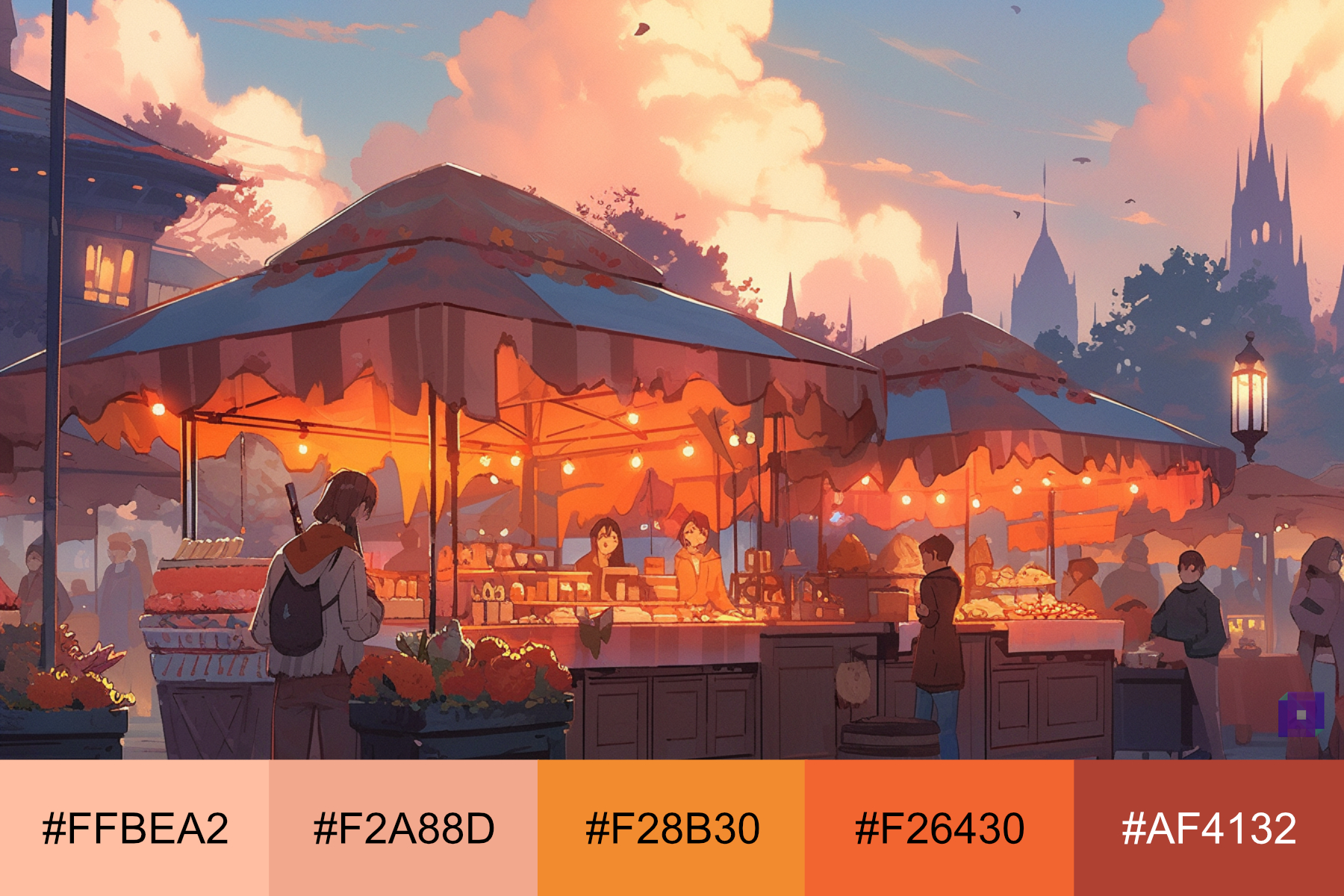
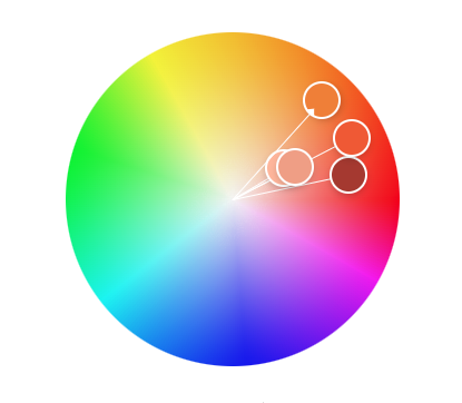
Look at this beautiful illustration which is mostly orange, it gives a feeling of warmth, usefulness, and positive vibes.
Purple
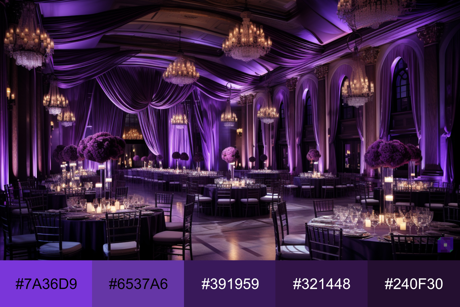
Purple is a color that often makes people think of mystery and luxury. It can represent creativity, wisdom, and dignity. In many cultures, purple is a color of royalty and spirituality. When you see purple, it makes you feel inspired, imaginative, or thoughtful.
A famous example of the color purple is the logo of the company Cadbury, the famous chocolate brand. The purple in the Cadbury logo is recognizable and has become a brand symbol. Purple shows luxury, quality, and treat, just like the company’s goal to make tasty, top-quality chocolates.

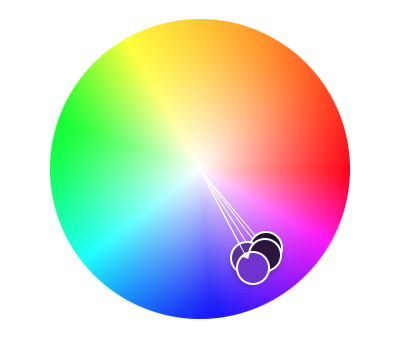
This image of a luxurious banquet hall has many tones of purple that convey elegance and quality.
Black
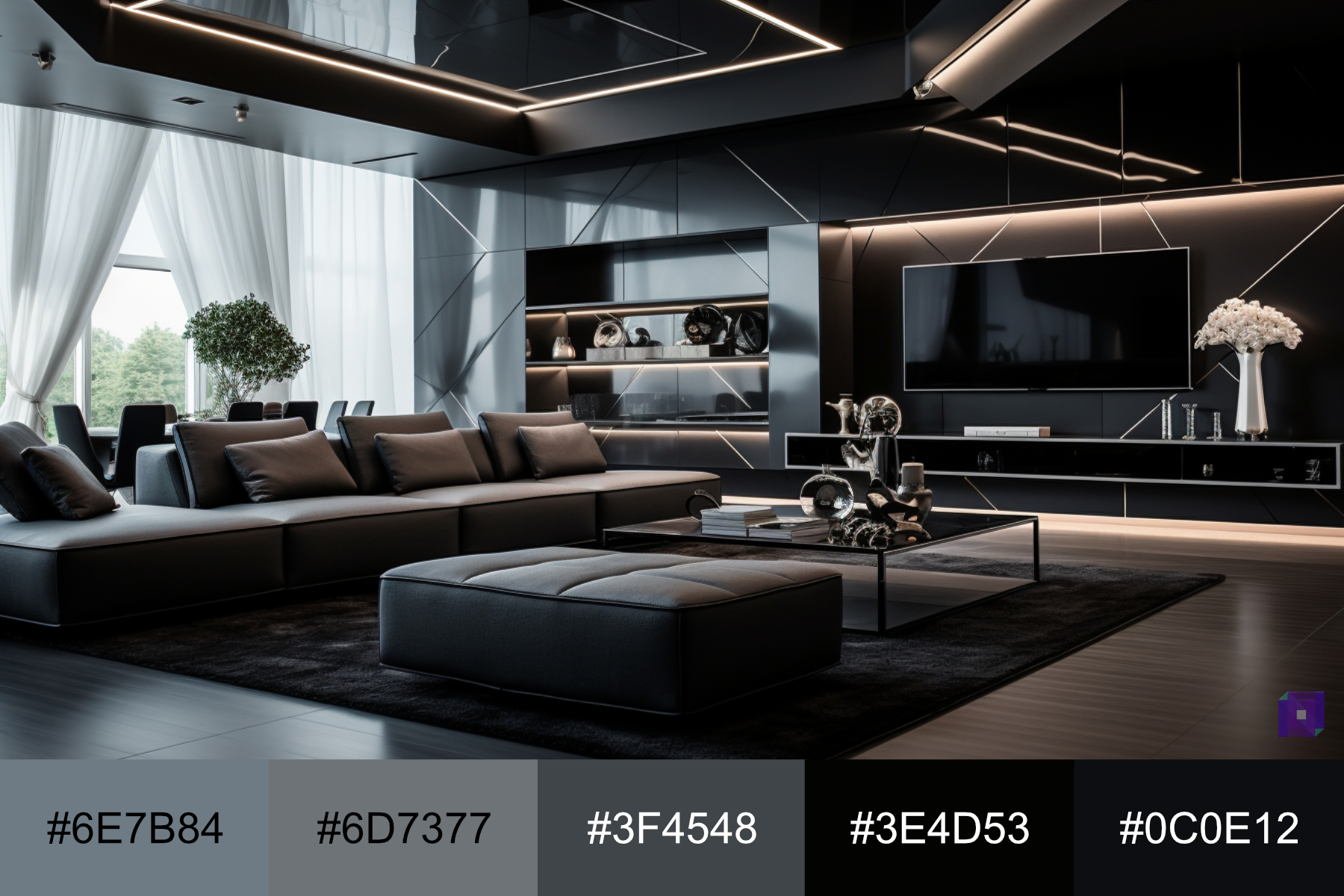
Black is a color that often makes people think of power and elegance. It can represent strength, authority, and sophistication. In many cultures, black is a color of formality and mystery. So, when you see black, it might make you feel strong, serious, or stylish.
A great example of the color black is the logo of the company Apple. The black color in the Apple logo is very recognizable and has become a brand symbol. It’s used to show class, new ideas, and smooth design, just like the company’s goal to make top-quality, advanced tech products.

An interior space with black tones that convey elegance, a strong innovative style, and elegance.
White
White is a color that often makes people think of purity and simplicity. It can represent cleanliness, innocence, and peace. In many cultures, white is a color of new beginnings and possibilities. So, when you see white, it might make you feel calm, clear, or hopeful.
A famous example of the color white is the logo of the company Adidas. The white color in the Adidas logo is instantly recognizable and has become a symbol of the brand. It conveys a sense of simplicity, performance, and quality, aligning with the company’s mission to create high-quality sports and lifestyle products.

This sleek minimalist office with mostly white tones conveys simplicity, performance and clam.

Choosing A Color Scheme
When choosing a color scheme, there are a few things you should think about. First, consider the mood or feeling you want to create. Different colors can make people feel differently, like how blue can be calming and red can be exciting.
Next, think about where you’re getting your inspiration, and it can be anything from nature to your favorite art, movies, comic books, or video games.
Also, remember to refer back to the color wheel and the color schemes we discussed, like complementary or analogous. These can help guide you in picking colors that go well together.
Lastly, remember to experiment and have fun with it! Choosing a color scheme is a chance to be creative and express yourself.
Using Color Palettes in 3D Art and Design
There are a few things to remember when using color palettes in 3D art and design. First, think about the mood or feeling you want your art to give off. Different colors can create different moods, like how cool colors calm a scene, while warm colors might make it feel energetic.
Next, try out different color schemes. You might use a monochromatic scheme for a simple, harmonious look or a complementary scheme to create a strong contrast.
Also, consider how the colors will look in different lighting and from different angles. In 3D art, the way light hits an object can change how its color looks.
Finally, remember to check your design in grayscale. You can see if there’s enough contrast between different parts of your design. If everything blends in grayscale, you might need to adjust your colors to make certain elements stand out more.
Color Selection Tools
There are excellent online tools for creating and exploring color schemes. Let’s explore some of these tools.
Adobe Color
Adobe Color is a tool that can help you pick colors for your art or design. It has a color wheel that you can use to find different color schemes, like complementary or triadic. You can also explore color palettes that other people have made and save your palettes to use later. Plus, if you have a picture with colors you like, you can upload it to Adobe Color, and it will help you make a palette from those colors.
Coolors
Coolors is a fun and easy tool to help you pick colors for your art or design. With just a click of a button, it can generate a whole color palette for you. If you see a color you like, you can lock it in place and create more colors that go well with it. You can also adjust the colors, save palettes for later, and even explore palettes others have made.
Pinterest is an excellent tool for finding color inspiration. It’s a website where people share pictures of all sorts of things, from art and design to fashion and home decor. You can search for color palettes or a mood you want to capture, like ‘calm’ or ‘energetic.’ Then, you can save the pictures you like to your own ‘board’ to look at later. It’s a great way to explore color combinations and their use in actual designs.
Outro
So, that’s a lot about color theory and how it can affect 3D art and design! We’ve learned that color theory, in essence, is the science and art of using color to create impact, express emotion, and convey meaning in design.
We learned about different color schemes, what various colors mean, and how to choose a color palette. We’ve also talked about some tools that can help you pick colors.
Remember, color can change how your art or design feels, so carefully consider your colors. But most of all, remember to enjoy it and express yourself!

